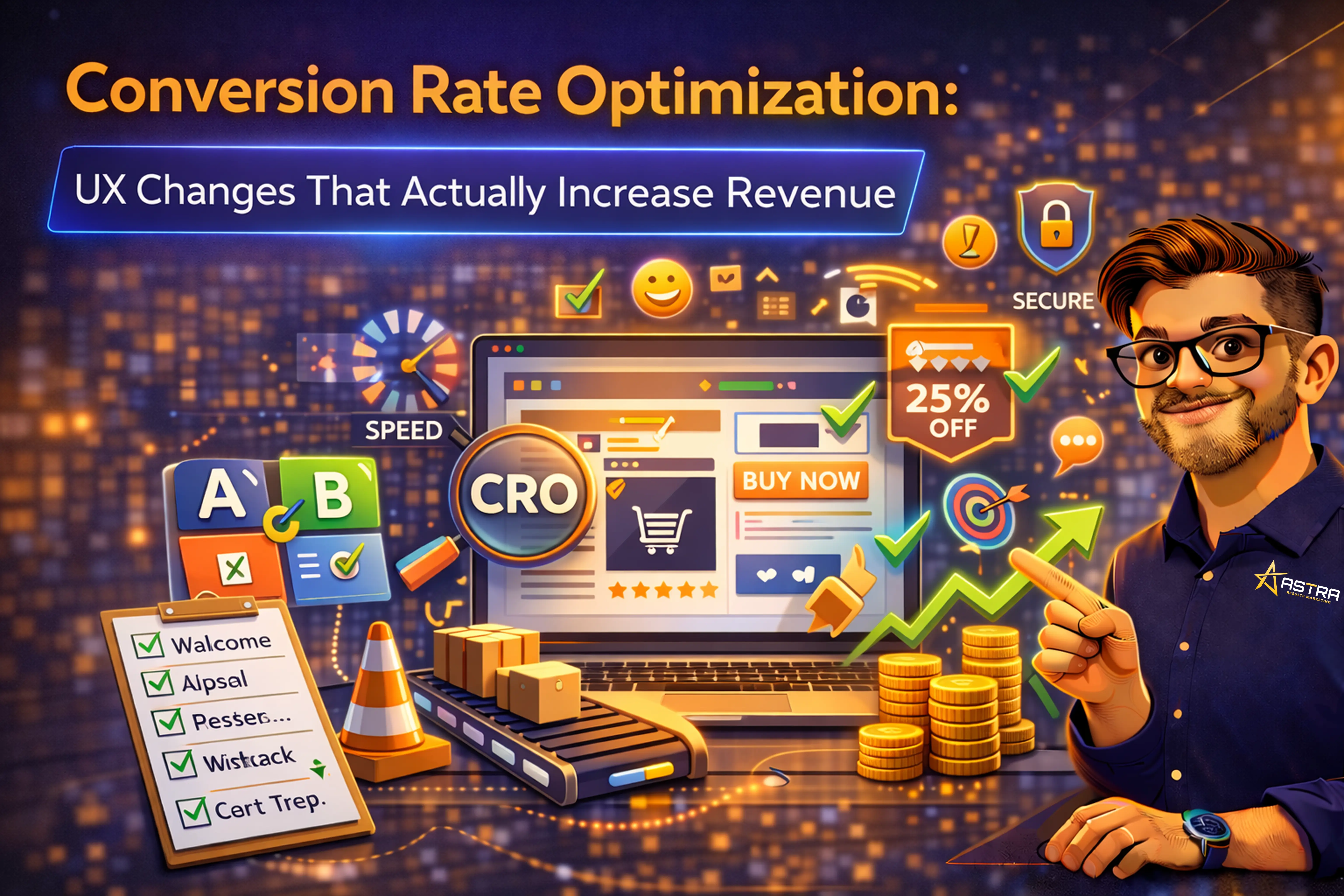
Conversion Rate Optimization: UX Changes That Actually Increase Revenue
The specific UX improvements, data-backed techniques, and testing strategies that turn more of your existing website traffic into customers—without spending a dollar more on advertising.
Published: February 2026 | Reading Time: ~11 minutes | Category: CRO & UX Design
Most businesses focus on driving more traffic. Smarter businesses focus on converting more of the traffic they already have. A mid-sized online retailer that increases its conversion rate from 2.5% to 3.0% gains 20% more sales without needing a single additional visitor (SQ Magazine). That is the power of conversion rate optimization—it turns the same traffic into more revenue, improving your ROI on every marketing dollar you have already spent.
The average website conversion rate across all industries sits at approximately 2.9% (SQ Magazine), with e-commerce averaging 2–4% (Skailama) and the global e-commerce rate reaching 3.34% in 2025 (Amra & Elma). Yet 68% of small businesses still operate without any defined CRO strategy (The Frank Agency), and 82% of marketers admit CRO is difficult to execute effectively. This guide closes that gap with specific, high-impact UX changes backed by data—the optimizations that make the biggest difference in the least time.
The Six Highest-Impact UX Changes for Conversion
Not all optimizations are created equal. These six UX improvements consistently deliver the largest conversion lifts, in order of typical impact:
1. Page Speed Optimization
Speed is the single strongest UX factor affecting conversions. A 1-second delay in load time reduces conversions by 7.2% (WiserReview). Pages loading under 2.5 seconds convert 31% higher than slower pages (WiserReview). A 1-second improvement in load time can boost conversions by 7%, and keeping load times under 2 seconds can increase conversions by as much as 15% (The Frank Agency). Yet mobile sites—which now account for over 60% of all traffic—frequently fail to meet these thresholds.
Priority speed optimizations: compress and serve images in WebP/AVIF format, implement lazy loading for below-the-fold content, minify CSS and JavaScript, enable browser caching, use a CDN, and eliminate unnecessary third-party scripts. Test your speed with Google’s PageSpeed Insights and target a Largest Contentful Paint under 2.5 seconds.
2. Form and Checkout Simplification
Every unnecessary step in your conversion process is a leakage point. Removing one form field increases conversions by 11%, and simplified checkout processes improve completion rates by 18% (WiserReview). The average e-commerce checkout still has 5.1 steps from cart to order review—a number that has not changed since 2012 (Email Vendor Selection). Brands that reduce this see immediate results.
Specific simplifications: offer guest checkout (forced account creation is a top abandonment cause), enable autofill for address and payment fields, reduce form fields to the absolute minimum required, use progress indicators to show how close the user is to completion, and implement one-page checkout where possible.
3. Personalized Calls to Action
Your CTAs are the most direct conversion lever on any page. Personalized CTAs convert 202% better than generic ones (Amra & Elma, 2025)—with some studies showing up to a 42% improvement (The Frank Agency). Even minor wording changes matter: shifting CTA copy from “you” to “me” (“Start your free trial” to “Start my free trial”) has been shown to boost conversions by 90% (The Frank Agency).
Design matters too. CTAs surrounded by white space can increase conversions by 232%, and anchor text CTAs embedded within content generate 121% more conversions than isolated buttons or banners (The Frank Agency). Use action-oriented language that communicates clear value: “Get my free demo” outperforms “Submit” every time.
4. Trust Signals and Social Proof
Users convert when they feel confident. Trust signals—customer reviews, security badges, clear pricing, money-back guarantees, and visible contact information—directly increase buyer confidence. Websites that meet accessibility standards like WCAG see a 15% higher average conversion rate (Amra & Elma), partly because accessible design improves usability for all visitors, not just those with disabilities.
Place trust signals at decision points: near CTAs, on checkout pages, and alongside pricing. Display review counts and star ratings on product pages. Show payment security badges during checkout. Include real customer testimonials with names and photos. Make your return policy and shipping information immediately visible—removing uncertainty is one of the fastest ways to increase conversion.
5. Mobile-First UX
Mobile traffic dominates (60%+ of all web traffic), but mobile conversion rates average only 1.6–2.9% compared to 4.8–5.0% on desktop (Martal Group). That gap represents an enormous opportunity. Companies that prioritize mobile optimization—simplifying mobile forms, using mobile-friendly payment methods, and speeding up load times—capture significantly more value from traffic they are already getting.
Mobile UX priorities: design for thumb-friendly tap targets (minimum 44x44 pixels), use single-column layouts, implement sticky CTAs that remain visible while scrolling, enable mobile payment options (Apple Pay, Google Pay), and ensure all critical information is visible without excessive scrolling. Test your mobile experience on actual devices, not just desktop simulators.
6. Landing Page Clarity
Landing pages with fewer than 10 elements consistently outperform pages packed with 40 or more (Amra & Elma). Clarity beats complexity. When a visitor arrives on your page, they should understand within 5 seconds: what you offer, who it is for, and what action to take. Every element that does not serve one of these three purposes is a distraction that reduces conversion.
High-converting landing page principles: use one clear headline communicating your primary value proposition, include a single prominent CTA above the fold, support claims with specific numbers and social proof, remove navigation menus on dedicated landing pages (to eliminate exit paths), and use directional cues (arrows, eye-gaze images) to guide attention toward the conversion action.
The Revenue Impact: If your site gets 10,000 monthly visitors at a 2% conversion rate, that is 200 conversions. Improving to 3% delivers 300 conversions—a 50% increase in leads or sales with zero additional ad spend. At a $500 average order value, that is $50,000 in additional monthly revenue.
Conversion by Device and Traffic Source
Understanding where your conversions come from—and where they leak—helps you prioritize optimization efforts:
| Dimension | Avg. Conversion Rate | Traffic Share | Optimization Priority |
|---|---|---|---|
| Desktop | 4.8–5.0% | ~35–40% | Optimize complex forms and checkout |
| Mobile | 1.6–2.9% | ~60%+ | Highest opportunity: close the gap with desktop |
| Email traffic | ~2.8% (B2C highest) | Varies | Personalized landing pages for email campaigns |
| Direct/referral | Higher intent; strong conversion | Varies | Optimize for returning visitors |
| Paid search | ~1.2% (B2C) | Varies | Landing page relevance and Quality Score |
The biggest single opportunity for most businesses is closing the mobile conversion gap. Desktop visitors are roughly 2x more likely to convert than mobile visitors (Martal Group), yet mobile drives the majority of traffic. Even modest improvements in mobile UX can dramatically increase total conversions.
Building a Testing Culture
A/B testing is used by 58% of marketers, making it the most common CRO tactic (Amra & Elma). But the real competitive advantage comes not from running occasional tests, but from building a systematic testing culture where experimentation is continuous.
What to Test (In Priority Order)
- Headlines and value propositions: Your headline is the first thing visitors see. Test different angles: benefit-focused vs. problem-focused, specific numbers vs. general claims, question-based vs. statement-based.
- CTA copy, color, and placement: Test action-oriented variations, button colors that contrast with your page design, and placement above the fold vs. within content.
- Form length and field order: Remove fields one at a time and measure impact. Test multi-step forms vs. single-page forms. Test whether asking for email first vs. last changes completion rates.
- Social proof placement: Test testimonials near CTAs vs. in dedicated sections. Test star ratings on product cards vs. only on product pages. Test the impact of review quantity (“2,400+ reviews” vs. “Highly rated”).
- Page layout and content hierarchy: Test long-form vs. short-form pages. Test image placement. Test video above the fold vs. further down the page.
Testing Best Practices
- Test one variable at a time. A/B tests with multiple changes cannot tell you which change caused the result. Isolate variables for clear, actionable insights.
- Run tests to statistical significance. Do not call a test early because results look promising. Most testing platforms indicate when a result reaches 95% confidence—wait for it.
- Document everything. Record the hypothesis, the variation, the sample size, and the result for every test. This prevents repeating failed experiments and builds institutional knowledge.
- Small, regular tests outperform occasional redesigns. Continuous small optimizations compound over time and deliver more sustainable improvement than one-time overhauls. The average ROI for CRO investments is approximately 223% (SQ Magazine), and longer-term programs of 6+ months outperform short efforts due to learning and compounding effects.
The Psychology Behind High-Converting UX
CRO is not just about layout and speed—it is about understanding why people make decisions and designing experiences that work with human psychology:
- Loss aversion: People feel losses more strongly than equivalent gains. Frame CTAs around what visitors will miss (“Don’t miss out on 30% savings”) rather than what they will gain. Limited-time offers and urgency messaging leverage this principle—urgency nudges can increase bookings by 20% (ConvertCart).
- Cognitive load: Every decision a user has to make depletes mental energy. Reduce choices, simplify navigation, and guide users toward a single primary action per page. Pages with fewer elements convert better because they demand less mental effort.
- Social validation: People follow the behavior of others. Display customer counts (“Join 15,000+ businesses”), real-time purchase notifications, and customer testimonials prominently. These signals provide the reassurance that others have already taken the action the visitor is considering.
- The endowment effect: People value things more once they feel ownership. Free trials, interactive product configurators, and “save your progress” features create a sense of investment that increases conversion to paid. Quizzes and calculators generate warm leads because the user has already invested time and attention.
Your 90-Day CRO Roadmap
Start with the highest-impact, lowest-effort optimizations and build from there:
Days 1–30: Foundation
- Install analytics and heatmap tools (Google Analytics 4, Hotjar or Microsoft Clarity).
- Identify your top 5 highest-traffic pages and map their current conversion rates.
- Fix page speed issues on all key pages (target LCP under 2.5 seconds).
- Simplify your primary conversion form—remove at least one field.
- Add trust signals (reviews, security badges) to your checkout or lead capture page.
Days 31–60: Testing
- Launch your first A/B test on your highest-traffic landing page (headline or CTA).
- Implement personalized CTAs based on traffic source or visitor segment.
- Optimize mobile checkout or lead form experience based on heatmap data.
- Review and reduce checkout steps—implement guest checkout if not already available.
Days 61–90: Scaling
- Analyze first test results and implement winning variations permanently.
- Launch tests on your next three highest-traffic pages.
- Implement exit-intent offers on pages with high abandonment rates.
- Build a testing backlog with prioritized hypotheses for ongoing optimization.
- Establish a weekly CRO review cadence to track metrics and plan next tests.
CRO as a Compounding Growth Strategy
Conversion rate optimization is not a one-time project—it is a compounding growth strategy. Each test that produces a winner raises your baseline permanently. Over 12 months of consistent testing, the cumulative effect of many small improvements creates a dramatically more effective website without a single additional dollar in advertising spend.
The businesses that win are not necessarily the ones driving the most traffic—they are the ones converting the highest percentage of their traffic into revenue. Start with speed, simplify your forms, personalize your CTAs, build trust at every decision point, and test continuously. The CRO tools market is projected to reach $5 billion by 2026 (SQ Magazine/WordStream) because the businesses investing in optimization are the ones seeing the strongest returns—an average 223% ROI that compounds with every improvement cycle.
References
The following sources informed this article:
- Amra & Elma (2025). “Best Conversion Rate Optimization Statistics 2025.”
- ConvertCart (2026). “2026 CRO Benchmarks & Insights (8 Industries).”
- Digidop (2026). “CRO 2026: The Complete Guide to Optimizing Your Website Conversion Rate.”
- Martal Group (2025). “Conversion Rate Statistics 2026: Best Practices.”
- SQ Magazine (2025). “Conversion Rate Optimization Statistics 2025: Benchmarks & Gains.”
- The Frank Agency (2026). “Conversion Rate Optimization Statistics [2026].”
- VWO (2026). “43 Conversion Rate Optimization Statistics [2026].”
- WiserReview (2026). “64 Latest Conversion Rate Optimization Statistics in 2026.”
- WordStream (2026). “19 Conversion Rate Optimization Statistics for 2026.”

