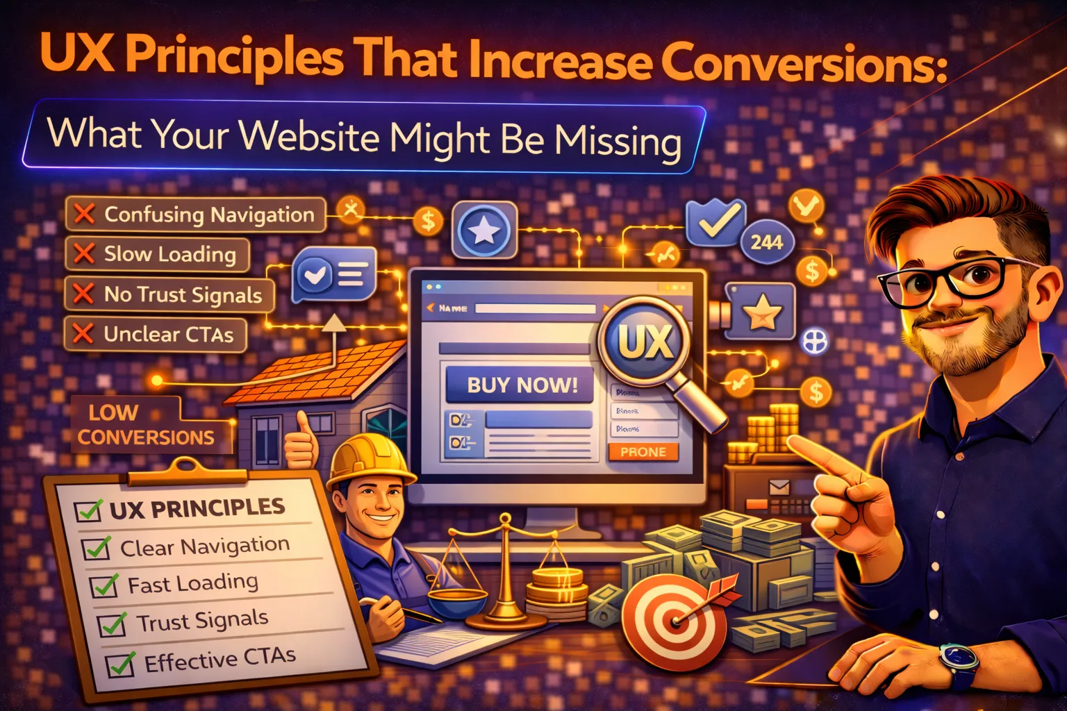
UX Principles That Increase Conversions: What Your Website Might Be Missing
The user experience principles that separate high-converting websites from digital dead ends—and the specific changes you can make to turn more visitors into leads and customers.
Published: March 22, 2026 | Reading Time: ~11 minutes | Category: Web & UX Design
Your website’s design is not a matter of aesthetics—it is a matter of revenue. (WebFX / Landingi), and (Maze). Within 10–20 seconds, a visitor has decided whether to stay or leave (Nielsen Norman Group). If your website creates confusion, friction, or distrust in those first moments, no amount of traffic or ad spend will fix your conversion problem.
The business impact is substantial. (Forrester / Maze). Meanwhile, (Maze). Yet most service business websites are built around what looks good to the business owner, not around what converts visitors into leads. The result: average conversion rates hovering around 2.5–3% when top-performing websites exceed 10–15% (Shopify / Design Studio UIUX).
This guide covers the UX principles that directly impact conversion rates for service businesses: the specific design, layout, navigation, and trust-building elements that separate high-converting websites from expensive digital brochures.
Principle 1: Clarity Over Cleverness
The most important UX principle is the simplest: visitors should immediately understand what you offer, who you serve, and what to do next. Nielsen Norman Group’s research shows users leave webpages within 10–20 seconds if the value proposition is not clear. That means your homepage headline, subheadline, and primary CTA must communicate your core message without requiring any scrolling, clicking, or guessing.
The Five-Second Test
Show your homepage to someone unfamiliar with your business for five seconds, then take it away. Can they answer three questions: What does this company do? Who do they serve? What should I do next? If the answer to any of these is unclear, your website is losing visitors before they ever see your services, pricing, or testimonials.
How to Implement Clarity
- Write a benefit-driven headline that describes the outcome you deliver, not what you do. “Keep Your Home Cool for Less” outperforms “HVAC Services in Miami” because it speaks to what the customer wants.
- Follow with a subheadline that adds specificity: who you serve, where you serve them, or what makes you different.
- Place your primary CTA (call, book, get a quote) above the fold with a contrasting color that stands out from the rest of the page.
- Avoid jargon and internal language—speak in the words your customers actually use when describing their problem.
Key Insight: High-converting websites do not try to say everything on the homepage. They say one thing clearly and make the next step obvious. Dropbox’s homepage leads with a single statement about what it offers. Service businesses should follow the same principle: one clear message, one clear action.
Principle 2: Visual Hierarchy That Guides Behavior
Users do not read websites—they scan them. Eye-tracking research confirms that visitors follow F-pattern or Z-pattern layouts (Permatech), meaning they scan the top of the page left to right, then move down the left side. You can control this scanning path through strategic use of size, color, contrast, and spacing (MondaySys). When your CTA buttons stand out visually, users naturally gravitate toward them.
The Hierarchy Stack
Every page on your website should have a clear hierarchy: the primary headline (largest, most prominent), supporting copy (medium, secondary), and the CTA (visually distinct, action-oriented). Everything else on the page supports this hierarchy—testimonials provide proof, imagery creates emotional connection, and feature lists answer objections. But the eye should always be drawn back to the action you want the visitor to take.
Common Hierarchy Mistakes
- Multiple competing CTAs of equal visual weight (the visitor does not know which to click).
- Navigation menus that are more visually prominent than the page’s primary content.
- Large hero images or sliders that push the headline and CTA below the fold.
- Decorative elements that distract from the conversion path.
- Body text and heading sizes that are too similar, creating a wall of uniformly weighted content.
The fix is straightforward: limit each page to one primary CTA and one primary message. Use size and color contrast to make the CTA impossible to miss. Remove or reduce every element that does not directly support the visitor’s path to conversion.
Principle 3: Speed as a Conversion Lever
Page speed is not a technical detail—it is a direct conversion lever. (Portent / Permatech). (Google). Amazon’s internal research found that a 100-millisecond delay cost 1% in sales. For a service business generating $50,000 per month through its website, each additional second of load time translates to approximately $3,500 in lost monthly revenue.
Speed Optimization Priorities
| Optimization | Impact | Implementation |
|---|---|---|
| Image compression | Typically the largest speed improvement; images are the heaviest page elements | Convert to WebP format, compress to 80% quality, lazy-load images below the fold |
| Code minification | Reduces file sizes for faster download and parsing | Minify CSS, JavaScript, and HTML; remove unused code and plugins |
| CDN implementation | Serves content from geographically closer servers | Use Cloudflare, AWS CloudFront, or equivalent CDN for all static assets |
| Third-party script audit | External scripts (chat widgets, analytics, social embeds) often add 2–5 seconds | Audit all third-party scripts; defer non-critical scripts; remove unused ones |
| Server response time | Affects Time to First Byte (TTFB); foundation for all other speed metrics | Upgrade hosting if TTFB exceeds 200ms; use server-side caching |
Target a Largest Contentful Paint (LCP) under 2.5 seconds, which is Google’s threshold for a “good” page experience. Test your speed using Google PageSpeed Insights and Lighthouse—both are free and provide specific recommendations. Speed improvements benefit not only conversions but also SEO rankings, as Core Web Vitals are a confirmed Google ranking factor.
Principle 4: Mobile-First Design Is Not Optional
(Statista / Permatech), and (Fibr.ai). Google’s mobile-first indexing means your mobile site is the primary version Google evaluates for search rankings. Yet many service business websites are still designed for desktop and then squeezed to fit mobile screens—creating a frustrating experience for the majority of their visitors.
Mobile UX Essentials for Service Businesses
- Sticky click-to-call button: on mobile, the easiest conversion action is a phone call. A persistent, visible call button should be accessible from every page without scrolling.
- Single-column layouts: mobile screens demand simplicity. Multi-column layouts that work on desktop become cramped and confusing on phones.
- Thumb-friendly navigation: bottom-anchored menus and large tap targets (minimum 44×44 pixels) accommodate one-handed mobile browsing.
- Simplified forms: reduce form fields to the absolute minimum on mobile. Name, phone number, and service needed is sufficient for most service business lead forms. Every additional field reduces completion rates.
- Fast load times on cellular networks: mobile users often browse on 4G or slower connections. Optimize images, defer non-critical resources, and test load times on throttled connections.
- No intrusive pop-ups: non-optimized pop-ups on mobile are difficult to close, frustrate users, and can trigger Google’s intrusive interstitial penalty (Contentsquare).
Test your mobile experience regularly—not just on the latest iPhone, but on mid-range Android devices that represent the majority of your market. Use Google’s Lighthouse tool to audit mobile performance and identify specific issues.
Principle 5: Reduce Friction at Every Decision Point
Friction is anything that slows, confuses, or discourages a visitor from completing the action you want them to take. Every extra click, extra form field, extra navigation step, and extra decision point reduces the percentage of visitors who convert. The highest-converting websites systematically identify and eliminate friction throughout the user journey.
Common Friction Points on Service Business Websites
| Friction Point | The Fix |
|---|---|
| Long forms with 7+ fields | Reduce to 3–5 essential fields; name, phone, service needed is sufficient for initial contact |
| No phone number visible without scrolling | Place a click-to-call phone number in the header and as a sticky mobile element |
| Multiple competing CTAs on one page | Limit to one primary CTA per page; secondary CTAs should be visually subordinate |
| Navigation menus on landing pages | Remove navigation from dedicated landing pages; every exit link reduces conversion |
| No indication of what happens after form submission | Set expectations: “We’ll call you within 2 hours” reduces anxiety and increases submissions |
| Requiring account creation before inquiry | Never require account creation for a service inquiry; remove all unnecessary barriers |
| Unclear pricing or process | Provide pricing ranges and a simple process overview (3–4 steps) to reduce uncertainty |
| Auto-playing media on mobile | Disable auto-play; it wastes data, startles users, and increases bounce rates |
The principle is simple: every element on your page should either build trust or move the visitor closer to conversion. If it does neither, it is friction—and it should be removed or redesigned.
Principle 6: Trust Signals at Every Stage of the Journey
For service businesses, conversion is fundamentally a trust decision. A homeowner hiring a roofer, a patient choosing a dentist, or a business owner selecting a marketing agency is making a high-stakes decision based largely on whether they trust the company behind the website. (Maze), which means trust must be built visually and systematically throughout the entire user experience.
The Trust Signal Framework
| Trust Signal | Where to Place It | Why It Works |
|---|---|---|
| Google review rating and count | Homepage hero section, near every CTA, footer | Third-party validation from real customers; the most trusted form of social proof |
| Customer testimonials with names | Service pages, near pricing, above forms | Specific, named testimonials feel authentic; generic quotes feel fabricated |
| Before-and-after project photos | Service pages, portfolio section, social media | Visual proof of results; more persuasive than any written claim |
| Licensing, insurance, and certifications | Footer, About page, service pages | Reduces risk perception; shows professionalism and legitimacy |
| Years in business / customers served | Homepage, About page, near CTAs | Longevity signals stability and experience |
| Industry badges and awards | Homepage, footer, sidebar | Third-party recognition reinforces authority |
| Real team photos | About page, homepage, team section | Humanizes the brand; visitors want to see the people behind the service |
The critical mistake most service businesses make is concentrating trust signals on the homepage and neglecting them elsewhere (Contentsquare). Trust signals need to be present on every page where a visitor might consider taking action—especially service pages, landing pages, and forms. A visitor who lands on an internal page from a Google search may never see your homepage; if that page lacks social proof and credibility markers, the visitor has no reason to trust you.
Principle 7: Behavioral Psychology That Drives Action
Beyond layout and design, the highest-converting websites apply behavioral psychology principles that influence decision-making. Four principles are particularly effective for service businesses (Toptal):
Reciprocity
Give value before asking for commitment. Offer a free resource—a cost calculator, a checklist, a guide, or a free consultation—before requesting contact information. When users receive something valuable, they feel a psychological obligation to reciprocate. A real estate platform that introduced a free trial saw a 20% increase in paid subscriptions by letting users experience value before purchasing (Toptal). For service businesses, a free inspection, free estimate, or free audit creates the same reciprocity dynamic.
Social Proof
People follow the behavior of others, especially when uncertain. Display the number of customers served, reviews collected, projects completed, or years in business. Show testimonials from customers similar to the visitor’s profile. When a homeowner sees that 500 other homeowners in their city chose your company, the decision feels safer. Place social proof near every decision point—next to CTAs, above forms, and on pricing pages.
Scarcity and Urgency
Limited availability increases perceived value. Seasonal promotions with clear end dates, limited consultation slots, or waitlists for popular services create urgency that motivates action. Use scarcity ethically and honestly—fake urgency damages trust. If you genuinely have limited availability during peak season, communicate it. Phrases like “Schedule this week—our summer calendar fills fast” are effective because they are believable.
Commitment and Consistency
People who take a small action are more likely to take a larger one. This is why multi-step forms that start with easy questions (zip code, service type) before asking for contact information often outperform single-step forms. The visitor has already committed to the process. Similarly, micro-conversions like downloading a guide or using a calculator build commitment that makes the next step—requesting a quote or booking a call—feel natural rather than abrupt.
Principle 8: Navigation That Removes Confusion
Navigation should help visitors find what they need without thinking. If a user has to figure out your menu structure, you have already introduced friction that reduces conversions.
Navigation Best Practices
- Limit main navigation to 5–7 items maximum. Research consistently shows that fewer options lead to faster decisions and lower bounce rates.
- Use descriptive labels that match what users actually search for: “Roof Repair” instead of “Our Services,” “Free Estimate” instead of “Contact.”
- Include a persistent CTA button in the navigation bar (e.g., “Get a Free Quote”) that stays visible as users scroll.
- Use breadcrumb navigation on interior pages so users always know where they are within the site structure.
- Add a search function for larger sites with multiple service areas or service categories.
- Ensure navigation is accessible: proper ARIA labels, keyboard navigability, and sufficient color contrast for users with visual impairments (WCAG 2.2 compliance).
On landing pages designed for ad traffic, consider removing the navigation menu entirely. Research shows that landing pages with fewer links convert at higher rates—every exit path you provide is an opportunity for the visitor to leave without converting.
Principle 9: Accessibility Expands Your Audience and Improves Conversions
Web accessibility is not just an ethical obligation—it is a conversion optimization strategy. Accessible websites perform better for all users because the principles that make a site accessible (clear structure, readable text, logical navigation, proper contrast) are the same principles that improve usability and conversions for everyone.
High-Impact Accessibility Improvements
- Sufficient color contrast between text and background (minimum 4.5:1 ratio for normal text, 3:1 for large text per WCAG 2.2).
- Alt text on all images for screen readers and improved SEO crawling.
- Proper HTML heading structure (H1 → H2 → H3) for logical content hierarchy.
- Keyboard-navigable forms and menus for users who cannot use a mouse.
- Closed captions on video content for users with hearing impairments.
- Descriptive link text (“Get your free roof estimate” instead of “Click here”).
- Form labels associated with input fields for screen reader compatibility.
These improvements benefit search engine crawling (better structure and alt text improve SEO), mobile usability (larger targets and clearer contrast help on small screens), and conversion rates (reduced confusion means more completions). Accessibility is not a separate project—it is integral to good UX design.
The UX Audit: How to Find What Your Website Is Missing
You do not need to rebuild your website from scratch to implement these principles. Start with a structured UX audit that identifies the highest-impact improvements:
- Step 1: Analyze User Behavior Data. Install heatmap tools (Hotjar or Microsoft Clarity—both have free tiers) and review where visitors click, how far they scroll, and where they drop off. Look for patterns: are visitors clicking on elements that are not links? Are they scrolling past your CTA without seeing it? Are they abandoning forms at specific fields? This data reveals exactly where your website’s UX is failing.
- Step 2: Run the Five-Second Test. Show your key pages to five people unfamiliar with your business. After five seconds, ask what the company does, who it serves, and what the next step is. If there is confusion, your clarity needs work.
- Step 3: Test Mobile Experience on Real Devices. Do not rely on desktop browser simulations. Test your website on actual phones—including mid-range Android devices, not just the latest iPhone. Check click-to-call functionality, form usability, load times on cellular connections, and overall navigation flow.
- Step 4: Audit Speed and Core Web Vitals. Run Google PageSpeed Insights on your five most important pages: homepage, top service pages, and contact/quote page. Address any metric flagged as “Needs Improvement” or “Poor,” starting with Largest Contentful Paint and Cumulative Layout Shift.
- Step 5: Map the Conversion Path. For each of your key service pages, trace the visitor’s journey from landing to conversion. Count every click, scroll, and decision required. If the path from landing to form submission requires more than two to three steps, simplify it. Every unnecessary step is a point where visitors drop off.
- Step 6: Prioritize and Test. Rank identified issues by estimated conversion impact and implementation difficulty. Fix high-impact, low-effort items first: CTA placement, form length, phone number visibility, and speed improvements typically deliver the fastest results. Then implement changes iteratively and measure the impact of each change against your baseline conversion rate.
Good UX Is Good Business
. . (Maze). These are not theoretical numbers—they are documented business outcomes from companies that prioritized user experience over aesthetics, strategy over decoration, and visitor needs over internal preferences.
The principles are straightforward: make your value proposition instantly clear, guide the eye toward conversion with visual hierarchy, eliminate speed barriers, design mobile-first, remove friction at every step, build trust with social proof, apply behavioral psychology, simplify navigation, and ensure accessibility. None of these require a complete website rebuild. Most can be implemented as iterative improvements to your existing site.
Start with the UX audit. Install heatmaps, run the five-second test, check your mobile experience, and measure your page speed. The data will tell you exactly what your website is missing—and each improvement you make moves your conversion rate closer to the 10–15% that top-performing websites achieve. In a market where the average conversion rate is 2.5–3%, even modest UX improvements can double your lead volume without spending a single additional dollar on traffic.
References
The following sources informed this article:
- Contentsquare (2026). "How to Improve UX to Increase Conversions."
- Design Studio UIUX (2026). "9 Expert Tips to Design a Website That Converts in 2026."
- Fibr.ai (2025). "CRO and UX: Simple Ways to Improve Conversions in 2025."
- Landingi (2025). "UX Optimization for Landing Pages: 10 CRO-Ready Best Practices."
- Maze (2026). "30+ Essential UX Stats for 2026 Strategy."
- MondaySys (2025). "UI/UX Design and Conversion Rates: How Great Design Boosts Growth."
- Parallel HQ (2025). "UX Design to Improve Website Conversions: Guide."
- Permatech (2025). "Top UX/UI Design Principles for High Converting Websites."
- Toptal (2025). "UX Design to Increase Website Conversions: A Guide."

