Rated 5 star on

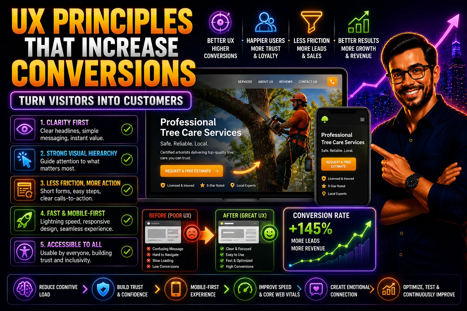
UX Principles That Increase Conversions on Your Website
User experience design isn't a luxury or an aesthetic concern — it's one of the most directly measurable drivers of conversion on any website. Good UX makes it effortless for visitors to do what they came to do (find information, contact you, book an appointment, make a purchase); bad UX adds friction at every step that bleeds conversions you've already paid to attract. The difference between a site with strong UX and a site with weak UX, holding all other variables constant, is often a 20-50% difference in conversion rate. For most businesses, that's the difference between marketing that works and marketing that quietly disappoints.
Published: July 4, 2026 | Reading Time: ~9 minutes | Category: Web/UX
The good news is that the UX principles that drive conversion aren't trends or matters of taste. They're consistent, well-tested, and applicable to virtually any service-business website. The principles aren't about clever design — they're about removing friction, respecting the visitor's cognitive effort, communicating clearly, and making the next step obvious. Applying them doesn't require a famous design firm or a massive budget; it requires understanding the principles and applying them methodically across the pages and flows where visitors actually convert.
This guide covers the UX principles that increase conversions on service-business websites: clarity over cleverness, the visual hierarchy that guides attention, reducing the cognitive load on visitors, friction reduction across forms and flows, performance and speed as UX, the mobile experience that the majority of visitors actually have, accessibility as a conversion factor, and the navigation and findability that helps visitors find what they're looking for. These principles compound — applied across a site, they produce conversion lifts that no single tactic delivers in isolation.
What You'll Learn
- Clarity over cleverness — and why obvious beats clever for conversion
- Visual hierarchy that guides attention to what matters most
- Reducing cognitive load — respecting visitors' limited mental effort
- Friction reduction across forms, flows, and contact paths
- Performance and speed as UX — and why slow sites lose visitors before they're read
- The mobile experience that the majority of visitors actually have
- Accessibility as a conversion factor (not just a compliance checkbox)
Clarity Over Cleverness
The single most important UX principle for conversion is clarity. A visitor who immediately understands what your business does, what you offer, who it's for, and what to do next converts at far higher rates than a visitor who has to figure any of that out. Clever headlines, abstract value propositions, and 'mysterious' messaging that's supposed to spark curiosity almost always underperform straightforward, specific communication.
This applies everywhere: the headline ('We help home services businesses get more leads through SEO and paid search' beats 'Marketing reimagined'), the calls to action ('Get a free roof inspection' beats 'Learn more'), the service descriptions, and the body content. Visitors give a website seconds, not minutes, to communicate what's on offer. The site that's immediately clear holds them; the site that's clever loses them. The bar isn't whether a smart visitor could figure it out — it's whether the average distracted visitor will, in the few seconds they're paying attention.
THE DON'T-MAKE-ME-THINK STANDARD: The standard from Steve Krug's classic UX book is that a visitor shouldn't have to think to use your website — every link, button, label, and instruction should be self-evident or at minimum self-explanatory. When visitors have to pause and figure something out (what does this button do, where do I click to contact them, what does this label mean), each moment of friction loses some percentage of them. Clarity isn't about dumbing things down; it's about respecting visitors' limited time and attention. The sites that convert best are the ones where everything is obvious.
Visual Hierarchy That Guides Attention
Visitors don't read websites — they scan them. Eye-tracking research consistently shows that visitors look at headlines, images, and prominent calls to action while skimming past body content. Good visual hierarchy uses this reality, guiding attention to the elements that matter most for conversion and making them impossible to miss.
- Size and prominence: the most important elements (the headline, the primary call to action, key trust signals) should be visually larger and more prominent than secondary elements. If everything is equally emphasized, nothing is.
- Contrast: high contrast between key elements and their surroundings makes them stand out. A call-to-action button that contrasts strongly with the page background gets clicked; one that blends in is missed.
- White space: generous white space around important elements draws attention to them. Cramped layouts where everything competes for attention bury what matters; spacious layouts make the important elements obvious.
- Positioning: the top-left area gets the most attention in Western reading patterns; calls to action above the fold get more engagement than those buried below. Put the most important elements where visitors actually look.
- Visual flow: the design should lead the eye in the order that matters — from headline to value proposition to call to action — using size, contrast, and positioning to create the flow.
Reducing Cognitive Load
Every choice, every piece of information, and every task you put on a visitor consumes some of their limited mental effort. When the total cognitive load exceeds what visitors are willing to spend, they leave. Reducing cognitive load — making the website easier to use mentally — directly increases conversion.
- Limit choices: pages with many options dilute attention and create decision paralysis. Focus pages on a single clear next step; offer many options only when many options are genuinely needed.
- Use familiar patterns: visitors carry expectations from every other site they've used. A site that follows familiar conventions (navigation in the header, contact in the top-right, search where searches usually live) is easier to use than one that reinvents conventions for no good reason.
- Chunk information: break content into scannable chunks (headers, short paragraphs, bullets) rather than walls of text. Visitors process chunks far more easily than dense prose.
- Simplify language: write the way visitors think, not the way industry insiders write. Jargon, abstract corporate language, and overly formal tone add cognitive load; plain language reduces it.
- Reduce visual complexity: cluttered pages with many competing elements add cognitive load. Clean, focused designs reduce it.
Friction Reduction Across Forms and Flows
Friction is everything that gets between a visitor and the conversion you want them to take. Every form field, every page transition, every confusing element, every required step adds friction — and friction loses conversions. The principle: remove every bit of friction that isn't genuinely necessary.
Form Friction
Forms are where most friction lives in service-business websites. Each additional field measurably reduces conversion. The discipline: ask only for what you genuinely need to follow up, and ask only at the point where you need it. A contact form that asks for name, phone or email, and a brief description of the need converts dramatically better than one asking for ten fields including address, budget, project type, timeline, and how they heard about you. The fields beyond minimum can be gathered in the follow-up conversation if needed.
Contact-Path Friction
How visitors contact you should be effortless. Prominent tap-to-call buttons (especially on mobile, where most visitors are). Visible contact options on every page, not just a 'Contact' page buried in the menu. Multiple contact options for different visitor preferences (call, form, email, sometimes chat). The visitor who's ready to contact you shouldn't have to hunt for how.
Navigation Friction
Visitors should be able to find what they're looking for without struggling. Clear, descriptive navigation labels (not clever or vague). Logical structure that matches how visitors think about your services. Predictable behavior (links look like links, buttons look like buttons, primary actions are obvious). When navigation creates friction, visitors leave rather than dig.
PRO TIP: Audit your most important pages for friction by walking through them as a visitor would, watching for every moment of effort or confusion. Every required form field that isn't necessary, every step that could be combined or skipped, every label that requires thought, every contact option that's hidden. Each instance of friction you remove lifts conversion incrementally, and they compound — small reductions across the visitor's path produce substantial conversion gains. Most service-business sites have meaningful friction that's invisible to the people who built them but costly to the visitors who encounter it.
Performance and Speed as UX
Page speed is often treated as a technical issue separate from UX, but it's one of the most direct UX factors in conversion. A slow page loses visitors before they ever see the design; even on a beautifully designed site, slow loading damages conversion measurably. Studies consistently show that every second of additional load time costs a meaningful percentage of conversions, and the effect is more pronounced on mobile.
The practical fixes are well known — compress and properly size images, minimize render-blocking scripts, use a fast host or CDN, lazy-load below-the-fold content, audit third-party scripts that slow the page. Most service-business websites have substantial room for improvement on Core Web Vitals, and the improvements pay for themselves through both better rankings (Google rewards fast sites) and better conversion (visitors don't bounce). Speed is a UX foundation; without it, the rest of the design doesn't get a chance to work.
The Mobile Experience
Most website visitors are on mobile. The mobile experience isn't a secondary version of the site — it's the primary experience that most of your visitors actually have. Designing mobile as an afterthought (a desktop design awkwardly squeezed onto a phone) loses the majority of your conversions.
- Designed for mobile first: layout, sizing, and interactions designed for the phone, then adapted up for larger screens — not the reverse.
- Tap-friendly elements: buttons and calls to action sized and spaced for tapping with a thumb. Tiny links jammed together are mis-tapped and frustrate users.
- Readable typography: type sized for mobile reading without zooming. If users have to pinch and zoom, they leave.
- Mobile-optimized forms: minimal fields, large input areas, appropriate keyboard types (numeric keypad for phone numbers, email keyboard for email fields).
- Prominent click-to-call: for service businesses, a prominent tap-to-call button is often the highest-converting mobile element. Make it impossible to miss.
- Mobile-appropriate content: streamlined content focused on what mobile visitors need (often: what you do, where you are, how to contact you, and proof you're trustworthy).
Accessibility as a Conversion Factor
Accessibility — designing your site so people with disabilities can use it — is often framed as a compliance issue or a moral one, but it's also a conversion issue. A meaningful share of visitors have some kind of disability (visual, motor, cognitive, or temporary impairment), and accessibility improvements help all of them convert. Beyond that, accessibility improvements often help non-disabled visitors too — clear typography, sufficient contrast, keyboard navigability, and descriptive labels improve usability for everyone.
Practical accessibility for service-business websites: sufficient color contrast between text and background, descriptive labels and alt text for images, keyboard navigability, readable font sizes, clear focus indicators for keyboard users, ARIA labels where appropriate, semantic HTML structure, and forms that work with assistive technology. Most of these improvements are technically modest, ethically important, and meaningfully improve usability and conversion. Treating accessibility as a checkbox misses the conversion lift and the broader audience reach it provides.
Navigation and Findability
Visitors should be able to find what they're looking for quickly. Navigation that fails — labels that don't communicate, structures that don't match how visitors think, hidden options that should be prominent — sends visitors away rather than into conversion.
- Clear, descriptive labels: 'Roof Replacement' beats 'Solutions.' 'Get a Quote' beats 'Engage.' Visitors should understand what's behind every label without clicking.
- Logical structure: organize navigation around what visitors are looking for, not your internal org chart. Services grouped the way customers think about them, not the way you internally categorize them.
- Visible primary navigation: the most important pages (services, contact, about) prominent in the top navigation; secondary pages accessible but not cluttering the main nav.
- Consistent navigation: the same navigation appearing in the same place on every page so visitors orient quickly.
- Breadcrumbs or context cues: helping visitors understand where they are in the site, especially on larger sites with deeper structure.
The Bottom Line
UX principles that increase conversions aren't trendy or aesthetic — they're consistent, well-tested, and applicable to virtually any service-business website. Clarity over cleverness so visitors immediately understand what's on offer. Visual hierarchy that guides attention to what matters. Reduced cognitive load that respects the visitor's mental effort. Friction reduction across forms, flows, and contact paths. Performance and speed as foundations of UX. Mobile experience as the primary experience most visitors actually have. Accessibility as a genuine conversion factor and audience expansion. Navigation and findability that helps visitors find what they need. Applied across a site, these principles produce conversion lifts that compound.
None of this requires a famous design firm or a massive budget. It requires understanding the principles and applying them methodically — pages audited against the principles, friction removed where it exists, clarity prioritized over cleverness, mobile experience treated as primary, performance kept fast, accessibility built in. The service businesses that take UX seriously and apply these principles consistently turn their websites into reliable conversion engines that capture the value their marketing creates. The businesses that treat UX as a secondary concern or a matter of taste leave conversion (and revenue) on the table. The principles are clear, the work is concrete, and the lift is real for any business willing to apply them.
Key Takeaways
- UX is a direct, measurable driver of conversion — good UX vs bad UX, holding other variables constant, often produces a 20-50% difference in conversion rate, making it one of the highest-leverage things to get right
- Clarity over cleverness: visitors give seconds, not minutes — immediate clear communication of what you do and what to do next beats clever, abstract, or mysterious messaging
- Visual hierarchy guides attention: size/prominence, contrast, white space, positioning, and visual flow direct the eye to what matters most for conversion (the headline, the value prop, the call to action)
- Reduce cognitive load: limit choices, use familiar patterns, chunk information into scannable pieces, simplify language, reduce visual complexity — every bit of mental effort you eliminate keeps more visitors engaged
- Reduce friction across forms (minimum necessary fields), contact paths (prominent and effortless), and navigation (clear labels, logical structure) — friction reduction is one of the highest-ROI UX improvements
- Speed is UX foundation: every second of additional load time costs measurable conversions, and slow pages damage even beautifully designed sites — Core Web Vitals improvements pay for themselves in both rankings and conversion
- Mobile is the primary experience for most visitors: design mobile-first, with tap-friendly elements, readable typography, mobile-optimized forms, prominent tap-to-call, and content focused on what mobile visitors need
- Accessibility is a conversion factor (not just compliance) — improvements help disabled users convert AND improve usability for everyone, with most improvements being technically modest and meaningfully impactful
READY TO BUILD A LEAD PIPELINE THAT'S YOURS? Astra Results Marketing builds and optimizes service-business websites around the UX principles that actually drive conversion — clarity, visual hierarchy, reduced cognitive load, friction reduction, performance, mobile-first design, accessibility, and intuitive navigation. We turn websites from aesthetic projects into conversion engines that capture the value your marketing creates. Stop losing conversions to UX problems your visitors notice but your team doesn't. Astra Results Marketing · astraresults.com · (+1) 786-643-3036