Rated 5 star on

Landing Pages: One Page, One Offer, One Action
Quick answer
A landing page converts paid traffic best when it serves one offer and one action. Match the page to the ad with the same promise, words and offer. Lead with a clear headline, then proof, then the action, all visible on a phone. Remove most navigation, keep forms short and test one change at a time.
You pay for every ad click. Where it lands decides whether the money turns into a lead. Send it to a busy home page with ten links and a menu, and most visitors leave. Send it to a page built for that one ad, with one offer and one clear next step, and far more of them act.
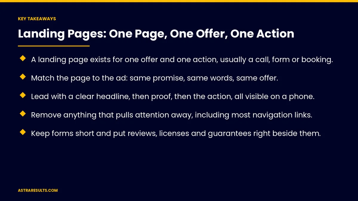
Key Takeaways
- A landing page exists for one offer and one action, usually a call, form or booking.
- Match the page to the ad: same promise, same words, same offer.
- Lead with a clear headline, then proof, then the action, all visible on a phone.
- Remove anything that pulls attention away, including most navigation links.
- Keep forms short and put reviews, licenses and guarantees right beside them.
- Make it fast on mobile, track every action, and test one change at a time.
Published: October 20, 2026 | Reading Time: ~10 minutes | Category: Landing Pages
This guide covers what a landing page is, how to structure one, how to match it to the ad, what to put near the form, and how to keep it fast and measurable. Put plainly: a landing page has one job, and everything on it should help with that job.
In This Playbook
- What a landing page is
- Match the page to the ad
- The structure that works
- Remove distractions
- Forms and calls
- Speed and mobile
- Track and test
- Where landing pages fit
- What should we measure on a landing page?
- The first three months
What a landing page is
A page with one job. It takes visitors from an ad, email or post and asks them to do one thing: call, book, request a quote or sign up.
Not your home page. A home page serves everyone and points in many directions. A landing page serves the people who clicked one ad.
Built for a campaign. Each service, offer or audience can have its own page, so the message stays specific.
Measured by one number. The share of visitors who take the action. Everything on the page is judged against it.
Match the page to the ad
Same promise. If the ad says "same-day AC repair in Doral," the headline says the same thing. A visitor should know in one second they're in the right place.
Same words. Use the terms from the ad and the search. Matching wording also helps your ads, as covered in Quality Score for expensive verticals.
Same offer. A free inspection, a consultation, a price. If the ad mentions it, the page shows it near the top.
Same language. A Spanish ad lands on a Spanish page, written for that audience, for the reasons in what changes when Spanish is a channel.
One page per ad group. Different services and offers get their own pages. One generic page for every ad weakens all of them.
The structure that works
A clear headline. What you do, for whom, and the main benefit, in one line.
A short supporting line. One or two sentences on why to choose you or what happens next.
The action, early. A call button or short form visible without scrolling on a phone.
Proof. Reviews, ratings, licenses, years in business, logos of clients, before-and-after photos where appropriate.
The details. What's included, how it works, service area, hours and price ranges where you can share them.
Answers to doubts. A few short questions and answers about cost, timing and guarantees.
The action again. Repeat the button or form at the bottom for people who read everything.
Remove distractions
Hide most navigation. Menus and links to other pages give visitors ways to leave. Keep the logo and a phone number.
One offer only. Two offers split attention and lower the rate for both.
No auto-playing video or pop-ups that block the page. They slow the page and annoy visitors on phones.
Short copy that earns its place. Every section should answer a question a visitor has, or help them act.
Keep the footer simple. Business name, address, phone, privacy policy. Nothing more is needed.
Forms and calls
Ask for as little as possible. Name, phone or email, and one question about what they need. Each extra field loses some visitors.
Phone numbers people can tap. Many visitors on phones would rather call than type.
Say what happens next. "We'll call you within 15 minutes" sets an expectation, and then you must meet it. The rules are in speed to lead.
Trust next to the form. Reviews, licenses or a guarantee right beside the button reduce last-second doubt.
Confirm every submission. A thank-you page and a message confirming the request, plus instant delivery to the person who follows up.
Speed and mobile
Most visitors are on phones. Design for a small screen first.
Fast pages convert better. Compress images, avoid heavy scripts and use good hosting. A page that takes several seconds to load loses people before they see the offer.
Large tap targets. Buttons and form fields big enough to use with a thumb.
Readable text. Short paragraphs, clear headings and enough contrast.
Check it on real phones. On mobile data, not just office Wi-Fi.
Track and test
Track every action. Calls from the page, form submissions and bookings, tied back to the ad and keyword, using attribution across every channel.
Measure leads that became customers. A page that brings many weak leads may be worse than one that brings fewer good ones.
Test one change at a time. Headline, offer, form length or proof. Change one thing, wait for enough visitors, then decide.
Start with the biggest levers. The offer and the headline usually matter more than button colors.
Keep a record. What you tested, what won and by how much, so you build on it.
Where landing pages fit
Paid search. Each ad group sends traffic to a matching page, as part of your Google Ads setup.
Social and display ads. Visitors from these are less ready to act, so the page needs more explanation and proof.
Email and texts. A page tied to one promotion or event.
High-ticket services. Consultations for surgery, legal work or financial advice need more trust on the page, as covered in CRO for high-ticket consultations.
Not a replacement for your site. Visitors who want to look around still need a good website, as built in website development.
What should we measure on a landing page?
Conversion rate. The share of visitors who call, submit or book.
Cost per lead. Ad spend divided by leads from the page.
Lead quality. The share of leads that become customers.
Cost per customer. The number that decides whether the page and the ad are worth it.
Page speed. Load time on mobile.
Test results. Which changes improved conversion, and by how much.
The first three months
Days 1–30: map and build
List your ad groups and the offer for each. Build one page per main service or offer, matched to its ads in English and Spanish. Keep forms short, put proof beside them and remove navigation. Set up call and form tracking tied to each ad.
Days 31–60: launch and measure
Send traffic to the new pages. Track conversion rate, cost per lead and which leads become customers. Answer every lead fast. Fix speed and mobile problems the data shows.
Days 61–90: test and improve
Test the headline or offer on your highest-traffic page first. Keep the winner, record the result and test the next lever. Roll what works out to the other pages.
How Astra builds landing pages
Astra Results Marketing builds a landing page for each main service, offer and audience, matched to the ad that sends people there. Every page has one offer, one action, proof beside the form and no distractions.
Pages are designed for phones first, built to load fast, available in English and Spanish where your market needs them, and tracked from the first click to the closed customer. Then we test one change at a time and keep what wins. Engagements begin with a page and ad review through our landing pages team.
Related reading
Frequently asked questions
What is a landing page?
A page built for one offer and one action, such as a call, form or booking, that visitors reach from an ad, email or post. Unlike a home page, it serves one audience and removes distractions so more visitors act.
Should ads go to the home page or a landing page?
Usually a landing page matched to the ad. A home page serves every visitor and offers many paths away. A matched landing page keeps the same promise and offer, which generally converts more of the clicks you paid for.
How long should a landing page form be?
As short as possible: name, phone or email, and one question about the need. Each extra field loses some visitors. Collect more detail on the follow-up call.
Should a landing page have navigation?
Usually not. Menus and links give visitors ways to leave. Keep the logo and a phone number, and a simple footer with your address and privacy policy.
What should we test first?
The offer and the headline, on your highest-traffic page. They usually matter more than design details. Change one thing at a time and wait for enough visitors before deciding.
Do we need separate Spanish landing pages?
If you run Spanish ads, yes. A Spanish ad should land on a Spanish page written for that audience, with the same offer, rather than an English page or an automatic translation.
Ready to make the clicks you pay for turn into leads? Astra Results Marketing builds a matched landing page for each service and offer, with one action, proof beside the form, fast mobile pages, English and Spanish versions and tracking from click to customer. ▸ CALL (786) 321-2866 · ▸ REQUEST YOUR CONSULTATION