Rated 5 star on

React Native + Web Design: Shared Design System
Quick answer
A shared design system defines colors, type and components once, so a React Native app and a website stay consistent. Design tokens hold the colors, type and spacing for both. Share components like buttons and forms, but usually not navigation. Document and version every change, give the system an owner and build accessibility in.
When a React Native app and a website are built separately, small differences pile up: two shades of the brand blue, three button styles and forms that behave differently. A shared design system fixes this at the source. Colors, type and components are defined once, so updates reach both together.
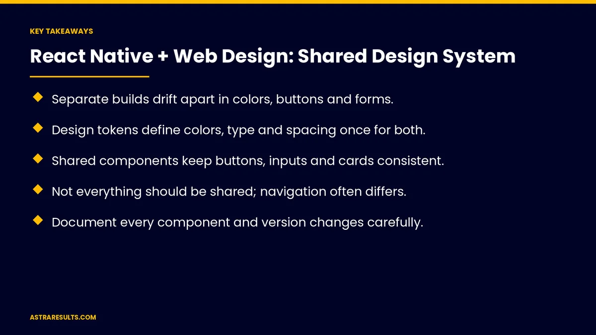
Key Takeaways
- Separate builds drift apart in colors, buttons and forms.
- Design tokens define colors, type and spacing once for both.
- Shared components keep buttons, inputs and cards consistent.
- Not everything should be shared; navigation often differs.
- Document every component and version changes carefully.
- Give the design system an owner, and build accessibility in.
Published: October 15, 2026 | Reading Time: ~8 minutes | Category: React Native Development
This guide covers sharing a design system between a React Native app and a website: design tokens, shared components, what to share and what not to, documentation, versions, owners, accessibility, languages and what to measure. Put plainly: define tokens once, share components where it makes sense and give the system an owner.
For keeping the brand consistent across surfaces, see one brand, two surfaces.
In This Playbook
- What do design tokens define for app and website?
- Shared components
- Which parts should the app and website share?
- Documentation
- Versions
- Owners
- Accessibility
- Languages
- Performance
- The business case
- What to measure
- The first three months
What do design tokens define for app and website?
Colors, type and spacing. Defined once, used everywhere.
Light and dark themes. From the same tokens.
One change, both surfaces. Update the token, and app and site follow.
The basics are covered in design systems for businesses.
Shared components
Buttons, inputs and cards. Same look and behavior.
Forms. Same validation and error messages.
Icons and images. One library.
Which parts should the app and website share?
Share the building blocks. Tokens and simple components.
Don't force navigation. Apps and websites move differently.
Respect each platform. Gestures on phones, hover on desktop.
Documentation
Every component explained. What it's for and how to use it.
Examples. Right and wrong usage.
One place to look. For designers and developers.
Versions
Change carefully. Updates can break screens.
Version numbers. So teams know what changed.
Planned upgrades. As covered in React Native maintenance.
Owners
One owner. Approves changes and keeps quality high.
Requests from teams. A simple process to propose changes.
Regular reviews. Remove components nobody uses.
Accessibility
Built into components. Labels, contrast and touch targets.
Tested on both. Screen readers on phones and the web.
Fixed once. Every screen improves.
Languages
Room for longer text. Spanish labels often run longer, as covered in bilingual mobile apps.
Shared wording. The same terms in both.
Performance
Light components. Fast on budget phones, as covered in performance in React Native.
The business case
Faster builds. New screens assembled from ready parts.
Fewer bugs. Fixed once in shared components.
One team. As in React Native: one team, two app stores and the business case for one codebase.
Marketing pages too. As in ad copy that matches the landing.
What to measure
Component reuse. Share of screens built from shared parts.
Design mismatches. Found in reviews.
Time to build new screens. Before and after.
Accessibility issues. Found and fixed.
Bugs fixed once. Fixes that reach both surfaces.
The first three months
Month one: tokens
Audit colors, type and spacing on both, define shared design tokens and name an owner.
Month two: components
Build shared buttons, inputs, cards and forms with accessibility, and document each one.
Month three: adopt
Move new screens to shared components, version changes and track reuse and mismatches.
How Astra builds shared design systems
Astra Results Marketing builds design systems shared between React Native apps and websites. We define tokens once, build accessible shared components, document them and set up ownership and versioning.
Engagements begin with a design system review through our React Native app development team.
Related reading
Frequently asked questions
What is a shared design system?
One set of colors, type, spacing and components used by both the app and the website.
What are design tokens?
Named values for colors, type and spacing, defined once and used on both surfaces.
Should navigation be shared too?
Usually not. Apps and websites move differently, so share building blocks instead.
Who should own the design system?
One person or small team that approves changes, keeps quality high and removes unused parts.
How does it help accessibility?
Accessibility built into shared components improves every screen at once.
What should we measure?
Component reuse, design mismatches, time to build new screens, accessibility issues and bugs fixed once.
Ready for one design system across your app and website? Astra Results Marketing builds shared design systems for React Native apps and websites, with tokens, accessible components and clear ownership. ▸ CALL (786) 321-2866 · ▸ REQUEST YOUR CONSULTATION