Rated 5 star on

Conversion-Focused Design: Every Page Has One Job
Quick answer
Conversion-focused design gives every page one clear job and one main action, such as booking a call or buying. Layout, headlines and images should lead the eye toward that action. Place reviews, examples and clear pricing near the button to remove doubt. Measure each page by its own job, not by overall traffic.
Many business websites try to say everything on every page. The homepage lists every service, the service page links to the blog, the blog pushes the newsletter, and the visitor leaves without doing anything. Conversion-focused design starts with a simple rule: decide what each page is for, then design everything on it to support that one job.
Key Takeaways
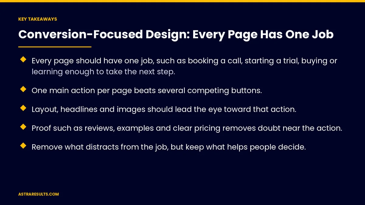
- Every page should have one job, such as booking a call, starting a trial, buying or learning enough to take the next step.
- One main action per page beats several competing buttons.
- Layout, headlines and images should lead the eye toward that action.
- Proof such as reviews, examples and clear pricing removes doubt near the action.
- Remove what distracts from the job, but keep what helps people decide.
- Measure each page by its own job, not by overall traffic.
Published: October 12, 2026 | Reading Time: ~8 minutes | Category: UI/UX Web Design
This guide covers how to give every page a clear job, choose one main action, build a layout that leads to it, add the proof that makes people act and test what works. Put plainly: one page, one job, one main action, and everything else in support.
In This Playbook
- Why pages need one job
- Giving each page its job
- One main action
- Layout that leads
- Proof near the action
- Remove distractions, keep help
- Test and improve
- Planning and budgeting the work
- What to measure
- The first three months
Why pages need one job
Too many choices stall decisions. When a page offers six buttons, visitors often choose none.
Mixed messages confuse. A page trying to sell, inform and recruit at once does none of them well.
Clear jobs make design easier. Every element can be judged by one question: does it help this page do its job?
The bigger picture. How design drives sales is covered in websites that sell.
Giving each page its job
Homepage. Help visitors find the right path quickly.
Service pages. Get the right visitor to request a quote or book a call.
Product pages. Get the shopper to add to cart, with delivery and costs clear near the price, as covered in international shipping as a marketing message.
Landing pages. Match one ad or campaign to one action, as covered in landing page vs homepage.
Articles. Answer a question well, then offer one logical next step. For software companies, problem pages lead to solution pages, as covered in SaaS SEO.
One main action
Choose it first. Before any layout, write down the one action you want.
Make it obvious. One main button, repeated where it makes sense, with a clear label like "Book a free estimate."
Keep secondary options quiet. A phone number or a "learn more" link can stay, but smaller and less prominent.
Say what happens next. "We'll call you within one business day" reduces hesitation.
Layout that leads
Headline states the value. What the visitor gets, in plain words.
Order follows the decision. Problem, solution, proof, action.
Space and contrast. The main button stands out by color and space, not by shouting.
Mobile first. Most visitors arrive on phones, so the action must be easy to tap.
Short forms. Ask only what you need to respond.
Proof near the action
Reviews and ratings. Real customer words near the button.
Examples. Before-and-after work, case results or product photos.
Clear pricing or ranges. Where possible, so visitors aren't guessing.
Trust details. Licenses, guarantees you offer in writing and your phone number and address.
Remove distractions, keep help
Cut what pulls away. Pop-ups, unrelated links and auto-playing videos that compete with the action.
Keep what helps people decide. Answers to common questions, details on the process and contact options.
Navigation stays useful. Don't trap visitors, but don't send them wandering either.
Speed counts. Slow pages lose visitors before they see the action.
Test and improve
Start with the biggest levers. Headline, main action and proof, in the order covered in landing page testing.
One change at a time. So you know what made the difference.
Enough visitors. Small sites may need longer tests, or simple before-and-after comparisons.
Watch real behavior. Session recordings and heatmaps show where visitors stop.
Planning and budgeting the work
Map pages and jobs first. Before design starts, list each page and its job.
Build time for testing. After launch, as covered in website development timelines.
Know the costs. Design, build and testing budgets are covered in what a business website costs.
What to measure
Each page's job. Quote requests from service pages, add-to-cart from product pages, next clicks from articles.
Conversion rate by page. Not just site-wide.
Lead or order quality. The right visitors acting, not just more of them.
Revenue from the site. Tied to the numbers covered in website KPIs.
Drop-off points. Where visitors leave before acting.
The first three months
Days 1–30: jobs and baseline
List every key page and write its one job and main action. Record conversion rates by page. Find the pages with the most traffic and the weakest results.
Days 31–60: redesign the top pages
Rework the top pages around their job: clear headline, one main action, proof near the button and distractions removed. Check them on mobile.
Days 61–90: test and expand
Test headlines, actions and proof on the busiest pages. Measure each page against its job, then apply what works across the rest of the site.
How does Astra design websites for conversion?
Astra Results Marketing designs websites where every page has one clear job. We map each page's purpose, choose one main action, build layouts that lead to it and place proof where visitors decide.
Then we test and measure each page by its own job, not by traffic alone. Engagements begin with a page and conversion review through our UI/UX design team.
Related reading
Frequently asked questions
What is conversion-focused design?
Designing each page around one clear job and one main action, with the layout, headline, images and proof all supporting that action.
Should every page have only one button?
One main action, yes. Secondary options such as a phone number or a "learn more" link can stay, but smaller and less prominent so they don't compete.
What should the homepage's job be?
Helping visitors find the right path quickly, usually by pointing them to the right service, product or next step.
Where should reviews and proof go?
Near the main action, where visitors decide. Reviews, examples, clear pricing and trust details work best close to the button.
How do we know if a page is working?
Measure it by its own job: quote requests from service pages, add-to-cart from product pages, next clicks from articles, plus lead or order quality.
Where should we start?
With your busiest pages that convert poorly. Write each page's job, simplify to one main action, add proof near it and test the changes.
Ready for a website where every page does its job? Astra Results Marketing designs pages around one clear job and one main action, places proof where visitors decide and tests each page against its own goal. ▸ CALL (786) 321-2866 · ▸ REQUEST YOUR CONSULTATION