Rated 5 star on


Websites That Sell: Design for Conversion
Quick answer
A visitor decides within seconds whether a site is for them, so the homepage has that long to say what the business does and for whom. Every page needs one job, because a page with four equal calls to action has none. Forms lose submissions with each extra field, proof belongs beside the action, and speed is a revenue metric.
Most business websites are brochures with a contact page. They describe the company, list the services, show a stock photo of people shaking hands, and wait. Traffic arrives from ads and search, looks around, and leaves. The owner concludes they need more traffic, when what they needed was a site that did something with the traffic they already had.
Key Takeaways
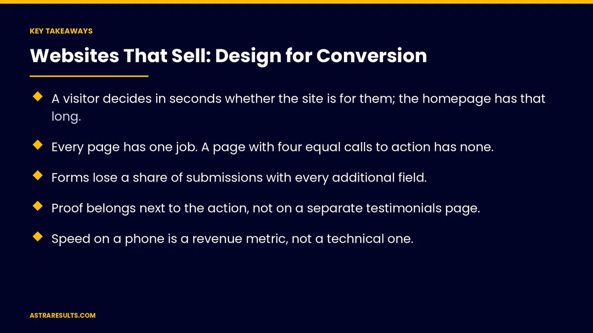
- A visitor decides in seconds whether the site is for them; the homepage has that long.
- Every page has one job. A page with four equal calls to action has none.
- Forms lose a share of submissions with every additional field.
- Proof belongs next to the action, not on a separate testimonials page.
- Speed on a phone is a revenue metric, not a technical one.
- A redesign that ignores the existing site's data converts worse than what it replaced.
Published: September 27, 2026 | Reading Time: ~14 minutes | Category: Web Design
A website that sells is built around a different question: what does this specific visitor need in order to act, and how fast can they get it? This guide covers the answers — the five-second test, one job per page, forms that get filled, where proof belongs, why speed is a revenue metric, and how not to destroy a working site in a redesign. The sentence to carry out of this: doubling conversion is cheaper than doubling traffic.
Guidance for owners and operators. Nothing here is legal advice. Accessibility, privacy, cookie consent and industry-specific disclosure requirements vary by jurisdiction and should be reviewed with counsel.
In This Playbook
- The five-second test
- One job per page
- Structure and navigation
- Forms that get filled
- Proof, placed where decisions happen
- Speed is a revenue metric
- Mobile is the site
- Accessibility, briefly and seriously
- Redesigns: how they go wrong
- Measuring a website
- The first 90 days
The five-second test
- What it is. Show the homepage to someone unfamiliar for five seconds, then ask what the business does, who it is for, and what they are supposed to do next.
- What usually happens. They can describe the industry and nothing else. The headline said something aspirational, the image was generic, and the action was a menu item.
- What passing looks like. The headline states what the business does and for whom, in plain words. The action is visible without scrolling. The visitor knows if they are in the right place.
- Why it decides everything downstream. A visitor who is not sure they are in the right place does not read further, and every other optimization applies to people who already left.
- The cheap fix. Most failing homepages are fixed by a clearer headline and a visible action, not by a redesign.
One job per page
- The principle. Each page exists to move a specific visitor one step. The page's design should make that step obvious and everything else secondary.
- Homepage. Orient and route. Not to explain everything; to get each visitor to the right next page fast.
- Service pages. Convince someone considering that specific service, and let them act. These are where paid traffic should land and where most buying happens, laid out in continuing the search.
- Location or service-area pages. Prove the business serves this area, with something genuinely specific to it.
- About. Build trust in the people. It converts more than owners expect, because buyers check it before contacting.
- Contact. Remove every obstacle. Phone, form, hours, address, map, and nothing else competing.
- The failure mode. Pages that try to do all five jobs, so a visitor with a clear need has to hunt.
Structure and navigation
- Shallow. Anything important reachable in two clicks from the homepage.
- Named for the visitor. Menu labels use the words customers use, not internal department names.
- Short. Seven or fewer top-level items. Long menus signal that nobody made a decision.
- Search only if it works. A site search that returns nothing useful is worse than no search.
- A visible path to contact on every page, in the same place.
- Breadcrumbs on deep pages, which help both visitors and machines understand the hierarchy.
Forms that get filled
- Fewer fields. Each additional field costs submissions. Name, phone or email, and one thing about the need is enough to start a conversation.
- Ask later what can be asked later. Budget, timeline, address and details belong in the conversation, not the gate.
- Explain what happens next. "We call back within an hour during business hours" converts better than a bare submit button, because it removes the fear of disappearing into a void.
- Mobile-first fields. Correct keyboards for phone and email, large touch targets, no fiddly dropdowns.
- Errors that help. Inline, specific, and never losing what was already typed.
- Alternatives to the form. A visible phone number and a message option, because a meaningful share of buyers will not fill anything in.
- The confirmation. An immediate on-screen confirmation and a message, so the visitor knows it worked.
Proof, placed where decisions happen
- Next to the action. Reviews, ratings, credentials and real photos near the button, not quarantined on a testimonials page nobody visits.
- Specific beats glowing. A review naming the service, the area and the outcome carries more weight than five stars with "great service."
- Real photos. The actual team, the actual work, the actual premises. Stock photography is recognized instantly and costs credibility.
- Numbers that are true. Years in business, jobs completed, locations served. Verifiable, and avoided if not.
- Credentials and partnerships where they mean something to the buyer, stated plainly rather than as a badge wall.
- Recent. Proof from four years ago reads as a business that peaked.
Speed is a revenue metric
- Why it matters commercially. A slow page loses visitors the business already paid to acquire, and speed affects search ranking on top of that. The metrics that define "fast" for search purposes are documented as Core Web Vitals (web.dev).
- Where the weight is. Uncompressed images, too many third-party scripts, heavy page builders, and video that autoloads.
- The realistic target. Usable on a mid-range phone on a normal connection in a couple of seconds.
- The metric. Real-user data from analytics, not a lab score from a fast desktop.
- The common trade. A design decision that adds two seconds is a business decision to lose some percentage of traffic. Make it consciously.
Mobile is the site
- The majority of visits. For most local and service businesses, well over half, often much more.
- What breaks on mobile. Menus that hide the phone number, forms with tiny fields, tables that overflow, buttons too close together, and text too small to read without zooming.
- Tap to call. The phone number is a link everywhere it appears.
- The test that matters. The owner completing the main action on their own phone, on mobile data, outside the office.
- Design order. Design the phone version first and expand it, rather than shrinking a desktop layout and hoping.
Accessibility, briefly and seriously
- Why it belongs here. Accessible sites are usable by more people, including customers with disabilities and everyone using a phone in sunlight. There are also legal requirements in many jurisdictions. The technical standard most jurisdictions reference is WCAG (Web Content Accessibility Guidelines).
- The basics. Sufficient color contrast, real text rather than text in images, alternative text on meaningful images, keyboard navigability, labeled form fields, and captions on video.
- The posture. Build it in rather than retrofitting, and treat the requirements as a compliance question for counsel rather than a design preference.
Redesigns: how they go wrong
- Losing SEO equity. New URLs without redirects, removed pages, changed structure, and months of ranking gone. This is the most expensive redesign mistake and the most common.
- Losing conversion. The old site had pages that converted. If nobody measured which, the new site is a guess that performs worse.
- Design-led, not data-led. A redesign driven by the owner's taste rather than by what the analytics show visitors do.
- Scope that never ends. Eighteen months, and the site launches describing services the business no longer sells.
- How to do it properly. Measure the current site first, map every URL to its replacement with redirects, keep what converts, change what does not, and launch in phases where possible, explored in protecting rankings through change.
Measuring a website
- Conversion rate by page and by traffic source. The number that tells you whether the site is doing its job.
- Cost per booked customer by landing page, which connects the site to the ad spend, according to attribution by channel.
- Form starts versus completions. Where the form loses people.
- Calls from the site, tracked, because for many businesses that is the main conversion.
- Speed from real users, segmented by device.
- Traffic, in the appendix. A site with more traffic and the same number of customers did not improve.
The first 90 days
Days 1–30: what gets measured and fixed first?
Conversion rate by page and source established. The five-second test run with real people. The headline and primary action fixed on the homepage. Speed measured from real users and the worst offenders addressed. Mobile completion tested by the owner on their own phone.
Days 31–60: pages and forms
Service pages rebuilt one job each, with proof beside the action. Forms cut to essential fields with a clear next-step promise. Tap-to-call everywhere. Confirmations added.
Days 61–90: evidence and expansion
Real photography replacing stock. Reviews and credentials placed at decision points. Accessibility basics addressed with counsel's requirements confirmed. Conversion by page compared to the Day 1 baseline.
How does Astra rebuild a site for conversion?
Astra Results Marketing measures the existing site before proposing anything, because a redesign that discards the pages that convert usually performs worse than what it replaced. Every page is built with one job, proof sits beside the action, forms ask only what is needed to start a conversation, and the phone version is designed first.
Redesigns map every URL to its replacement with redirects so rankings survive. Reporting leads with conversion rate by page and source and cost per booked customer by landing page. Engagements begin with a conversion audit through our UI/UX web design and development team.
Related reading
Frequently asked questions
What is the five-second test?
Showing the homepage to someone unfamiliar for five seconds and asking what the business does, who it is for, and what they should do next. Most fail: the visitor can name the industry and nothing else because the headline was aspirational, the image was generic and the action was a menu item. Passing means a plain headline, a visible action without scrolling, and instant clarity about whether they are in the right place.
What does "one job per page" mean?
Each page exists to move a specific visitor one step, so that step is obvious and everything else is secondary. The homepage orients and routes; service pages convince someone considering that service and let them act; location pages prove the area is served; About builds trust in the people, which converts more than owners expect. A page with four equal calls to action has none.
How should forms be designed?
With fewer fields, because each one costs submissions — name, phone or email, and one thing about the need is enough to start a conversation. Budget, timeline and details belong in the conversation rather than the gate. Say what happens next, because "we call back within an hour" beats a bare submit button. And always offer a visible phone number, since many buyers will not fill anything in.
Where should reviews and credentials go?
Next to the action, not on a separate testimonials page nobody visits. Specific proof beats glowing proof: a review naming the service, the area and the outcome carries more weight than five stars with "great service." Real photos of the actual team and work, because stock photography is recognized instantly and costs credibility. And recent, since proof from four years ago reads as a business that peaked.
Why is site speed a revenue issue?
Because a slow page loses visitors the business already paid to acquire, and speed also affects search ranking. The weight is uncompressed images, third-party scripts, heavy page builders and autoloading video. The target is usable on a mid-range phone in a couple of seconds, measured from real users rather than a lab score on a fast desktop.
What makes redesigns go wrong?
Losing SEO equity through new URLs without redirects, removed pages and changed structure — the most expensive and most common mistake. Losing conversion because nobody measured which pages were working before replacing them. Being driven by taste rather than by what analytics show visitors do. And scope that runs so long the site launches describing services the business no longer sells.
READY TO MAKE THE TRAFFIC YOU ALREADY HAVE WORTH MORE? Astra Results Marketing measures the existing site first, rebuilds pages one job each with proof beside the action, designs the phone version first, and protects rankings through every change. Astra Results Marketing · 1101 Brickell Ave, Miami, FL 33131 · +1 (786) 321-2866 · [email protected] Find us on Google · Yelp ▸ CALL (786) 321-2866 · ▸ REQUEST YOUR CONSULTATION