Rated 5 star on


Product Page Conversion: The Ten Fixes
Quick answer
Product pages convert better when they answer shoppers' questions before they leave. Start with photos that show scale and detail. Make prices clear and put shipping cost, delivery date and returns near the buy button. Add real reviews and keep the button visible on phones. Then test one fix at a time and track add-to-cart and purchases.
Product pages are where online stores win or lose the sale. Shoppers arrive with questions: what does it look like up close, what will it cost to ship, can I return it, will it fit? When the page answers them, they buy; when it doesn't, they leave. Most stores can lift sales with the same ten fixes.
Key Takeaways
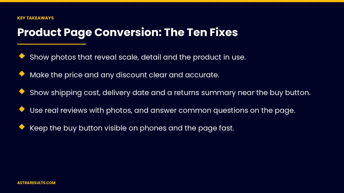
- Show photos that reveal scale, detail and the product in use.
- Make the price and any discount clear and accurate.
- Show shipping cost, delivery date and a returns summary near the buy button.
- Use real reviews with photos, and answer common questions on the page.
- Keep the buy button visible on phones and the page fast.
- Test one fix at a time and measure add-to-cart and purchases.
Published: October 23, 2026 | Reading Time: ~8 minutes | Category: E-Commerce Marketing
This guide covers ten product page fixes: photos, prices, shipping, returns, reviews, options, stock, the buy button, speed and specs, plus payments, Spanish pages, testing and what to measure. Put plainly: answer every buying question on the page, near the buy button, on a phone.
For the principles behind strong product pages, see product pages that convert.
In This Playbook
- 1. Photos that answer questions
- 2. Clear, accurate prices
- 3. Shipping cost and delivery date
- 4. A returns summary
- 5. Real reviews
- 6. Easy options
- 7. Accurate stock
- 8. A buy button that stays visible
- 9. Speed on phones
- 10. Specs and FAQs
- What should Spanish product pages include?
- Which product page fix should you test first?
- What to measure
- The first three months
1. Photos that answer questions
Scale. The product next to something familiar.
Detail. Close-ups of materials and features.
In use. Real settings, not just white backgrounds.
Short video. Where movement or size matters.
2. Clear, accurate prices
The full price, clearly. No hunting.
Real discounts. "Was" prices must reflect real past prices, as covered in Black Friday planning.
Bundles and savings. Shown plainly.
3. Shipping cost and delivery date
Near the buy button. Not only at checkout.
A delivery date. "Arrives by Thursday."
Free shipping thresholds. Shown with progress.
The settings are covered in shipping and returns settings.
4. A returns summary
One line near the buy button. "Free returns within 30 days."
A link to the full policy. For details.
5. Real reviews
Real buyers only. The FTC's rule bans fake reviews.
Photos from customers. More convincing than polished shots.
Questions and answers. Common questions answered by your team.
Proof without clutter, as covered in trust on a landing page.
6. Easy options
Sizes and colors. Clear choices, with photos for each.
Stock by option. Unavailable options marked.
Size guides. With measurements and fit notes.
7. Accurate stock
Real stock levels. No fake "only two left" messages.
Back-in-stock alerts. For sold-out items.
8. A buy button that stays visible
Sticky on phones. Always within reach.
Clear wording. "Add to cart" with the price.
Fast checkout options. Apple Pay and Google Pay, as in Apple ecosystem integration.
9. Speed on phones
Compressed images. Fast without losing quality.
Fewer apps and scripts. As covered in Shopify apps.
Mobile testing. As covered in landing page speed.
10. Specs and FAQs
Key specs first. Size, materials and compatibility.
Common questions answered. In clear question-and-answer format, as covered in question-shaped headings.
Care and use. How to use and maintain it.
What should Spanish product pages include?
Full translations. Descriptions, specs and policies.
Written natively. By fluent writers.
Which product page fix should you test first?
Start with the biggest gap. Often shipping clarity or photos.
Change one thing. Then compare.
Enough traffic. Wait for meaningful results.
What to measure
Add-to-cart rate. By product.
Purchase rate. From product page visits.
Questions to support. Fewer as pages improve.
Return rate. Clearer pages often mean fewer returns.
Mobile conversion. Compared with desktop.
The first three months
Days 1–30: audit
Check your top products against the ten fixes, and list the biggest gaps.
Days 31–60: fix
Improve photos, shipping and returns info, reviews and the mobile buy button on your top products.
Days 61–90: test and expand
Test changes one at a time, measure add-to-cart and purchases and roll winning fixes out to more products.
How does Astra improve product pages that don't convert?
Astra Results Marketing improves product pages that aren't converting. We audit against the ten fixes, improve photos, prices, shipping, reviews and speed, test one change at a time and roll winners out across your store.
Engagements begin with a product page review through our e-commerce marketing team.
Related reading
Frequently asked questions
What are the most important product page fixes?
Better photos, clear prices, shipping and returns info near the buy button, real reviews and fast pages on phones.
Where should shipping information appear?
Near the buy button, with cost and an expected delivery date, not only at checkout.
Are fake low-stock messages a problem?
Yes. They mislead shoppers and erode trust. Show accurate stock instead.
Should the buy button stay visible on phones?
Yes. A sticky buy button keeps it within reach as shoppers scroll.
How should we test changes?
One fix at a time, starting with the biggest gap, and wait for enough traffic to compare.
What should we measure?
Add-to-cart rate, purchase rate, support questions, return rate and mobile conversion.
Ready for product pages that sell? Astra Results Marketing audits your product pages against ten proven fixes, improves the biggest gaps and tests changes one at a time to lift sales. ▸ CALL (786) 321-2866 · ▸ REQUEST YOUR CONSULTATION